
Showing posts with label canvas. Show all posts
Showing posts with label canvas. Show all posts
Saturday, 10 November 2018
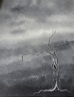
Problems with light
Sometimes taking a photograph of a painting can be a challenge. The paint could be glossy and reflect too much even if a flash isn't used. And sometimes the art just absorbs all the light and doesn't show well. The painting I'm showing here is of the former. It is a very dark painting, needs a lot of natural light to properly see all it has to offer. In the photo it actually shows up brighter than the actual painting. No matter what conditions I try to photograph it in it is never 100% accurate.

Thursday, 5 July 2018
July Show at T-Bird Cafe

This new piece, along with eleven others, is on exhibit for the month of July at T-Bird Cafe in Burnaby. If you are in the area of Production skytrain station T-Bird is just a short walk away at #106 - 3191 Thunderbird Crescent.
Sunday, 12 June 2016
A Slow Studio Sale...
As what often happens with artists, at some point one needs to have a studio sale. And while I don't really have much of a studio to speak of, there is nothing else to call it. I could use a little space cleared up for new work that is in progress. So I am going to slowly go through some of the old stuff and one by one offer them at a bit of a discount. Sale prices do not include any shipping costs.
The first piece up for sale is one I did in 2006. I have always found it a bit weird, the tree seems kind of flat to me, but the textured background is nice.
Title: "The End"
Size: 14" x 18"
Regular price: $202.00
Sale price: $151.00
Oil on canvas
This piece will be for sale for the next few weeks only. Please make any inquiries via email... cocke.jm@gmail.com
Wednesday, 13 January 2016

Nap time....
A working title for this little piece, but one that just may stick. When the ornamental cherry tree outside went dormant this winter a few of the dead leaves clung to it, refusing to drop. Their orange / brown colour providing some nice contrast against the sky. A good subject for trying out another palette knife painting. Now if only the visiting chickadees and juncos didn't move so fast ... I'd like to use one of them as the next painting subject.
Tuesday, 16 June 2015
A bit of a change...
Recently, a few changes in my life have left me with less time to paint. I like to paint slow, coming back to the work over and over again, often while it is still wet and workable (something I love about working with oils). With my slow style and new time constraints I'll be lucky to get anything accomplished! I decided that I needed to change things up and encourage myself to work faster in the process. I chose to use a small canvas, a palette knife and acrylic paint. By using acrylic I don't have the luxury of putting the work aside and coming back hours later to a still wet painting and therefore have to work faster. Using the palette knife forces me away from getting bogged down in fine detail and the amount of time that can take up. The small canvas gives me a chance at completing a piece in one go. My first attempt at this, shown here, seems to have gone alright.


Wednesday, 17 April 2013
Two more new pieces....

Here is another new piece, "Carrion", that was recently completed. For inspiration I began with a photograph of some trees, one almost completely bare and probably dying, which started me off for the tree in this painting. I then began to add a couple more trees lower down on the canvas only to realize that they didn't fit and had to remove them. I still felt that there was something lacking so I added two crows circling the tree. The title, while a bit morbid, fits with the presence of the crows, the dead tree, and makes further suggestion as to what could be lying at the base of the tree if only we could see it.

This piece, "Path Around the Rock", was actually begun ages ago and got pushed aside for some reason. I decided that now was the time to finish it and am very happy with the end product. I am always a bit taken with the patterns that I can find in the sand made by water and bits of debris, this painting is representative of those patterns and the small disruption of them made by the rock.
Tuesday, 16 April 2013
New Work: "Periwinkles Creeping"

I recently finished up a few new pieces for the Burnaby Artists Guild Spring Show. This is one of the new ones. Another little one, 8" x 8" like "Coastal Strawberries". I find that size a nice one to work with when I want to do a study of a subject.
Monday, 6 August 2012


Tuesday, 19 June 2012
Redwing Blackbird

This piece was done on a special request. I have never painted a bird of any sort before so I took this on as a challenge and had to do more research than I am accustomed to. The first step was to find a photo that would translate well into a painting. Fortunately I have a good source for bird photos and they had many for me to choose from and gave me full permission to copy from their work. I usually don't do any sort of rough draft for my paintings and let them develop how they want. However, since this was for something specific I practised drawing the bird first. I was quite happy with the initial drawing at its outline stage and then started to question my ability to recreate it on the canvas. A tip was given to me by a friend on how to transfer drawings onto canvas and I decided to give it a try. I made a photocopy of the outline drawing and on the back of the copy I painted a solid block of burnt umber gouache pigment. When that was dry I lay the copy on the canvas where I had already painted a background and retraced the outline of the bird. The burnt umber pigment transferred to the canvas and I now had an outline of the bird in the exact proportions that I wanted and the exact placement. I used that to fill in the basic parts of the bird and then built up the paint to give a sense of definition. I found this task difficult due to the black feathers and felt that the careful addition of white paint was the best way to go about it. For a first attempt at a bird I think it went pretty well.
Monday, 21 May 2012
Commission continuation
Now that the branches are complete for the four panels that I am working on I can begin the blossoms. I prefer to wait until the branches are finished and dry to the touch as this makes it easier from my end to work on the flowers. I don't have to worry about putting my hand on the canvas to steady my brush, or that I might accidentally smudge something.

This is an example of how I start each individual blossom. I use a purple / blue to divide the inside of the flower by marking off the edges of the petals, the dip in the middle of each petal and the centre.

I then use a cleaner brush to gently blend the white of the petal with the purple of the divisions.

I will then go back and add more purple to the original divisions. I may do this process a few times, gradually darkening the centre area of each flower. Most of the time the resulting blossom looks quite messy close up, but once I back up a few feet that messiness is not noticeable. I have to keep this in mind when working on these as I can get in the habit of working very close to the canvas, trying to make the flower perfect from a few inches away. This is not realistic for a painting as the viewer is likely to be standing at least a few feet away, so while I am working on it I must repeatedly back up and view the work from a distance until I am satisfied with the detail and depth in each blossom from that distance.

This is an example of how I start each individual blossom. I use a purple / blue to divide the inside of the flower by marking off the edges of the petals, the dip in the middle of each petal and the centre.
I then use a cleaner brush to gently blend the white of the petal with the purple of the divisions.

I will then go back and add more purple to the original divisions. I may do this process a few times, gradually darkening the centre area of each flower. Most of the time the resulting blossom looks quite messy close up, but once I back up a few feet that messiness is not noticeable. I have to keep this in mind when working on these as I can get in the habit of working very close to the canvas, trying to make the flower perfect from a few inches away. This is not realistic for a painting as the viewer is likely to be standing at least a few feet away, so while I am working on it I must repeatedly back up and view the work from a distance until I am satisfied with the detail and depth in each blossom from that distance.
Sunday, 8 April 2012
Commission work in progress
If you take a look on my "Paintings" page you will find 3 narrow pieces with branches and blossoms on them, years ago I made four similar pieces and decided not to sell them. Recently I was asked to do some commission pieces which are very much like the four blossom panels that I have. When I make one of these blossom pieces I progress in a specific way, first the background colour, then when that is dry to the touch I paint the branches on in black. Each of the four panels have their background colour finished and I am at the branches stage.

In the above photo is a section of one of the branches, I have just begun to add a bit of dimension to the uppermost tip with some white paint. You should be able to see that I have left some of the black paint for the branch in chunky bits, I like to do this to add dimension to the painting and give the branch the effect of coming up off the canvas. These chunky areas are made by twisting the brush as I move it along the branch, squeezing excess paint out and leaving it on the canvas. These pieces also work as a nice guide as to where to put some white paint for more dimension as seen in the next photo...

Much of the white highlights are added using a fairly dry brush and done when the black branches are dry to the touch as I don't want too much mixing of the paint. The blossoms will be added once the branches are finished and I will update that process in a later post.

In the above photo is a section of one of the branches, I have just begun to add a bit of dimension to the uppermost tip with some white paint. You should be able to see that I have left some of the black paint for the branch in chunky bits, I like to do this to add dimension to the painting and give the branch the effect of coming up off the canvas. These chunky areas are made by twisting the brush as I move it along the branch, squeezing excess paint out and leaving it on the canvas. These pieces also work as a nice guide as to where to put some white paint for more dimension as seen in the next photo...
Much of the white highlights are added using a fairly dry brush and done when the black branches are dry to the touch as I don't want too much mixing of the paint. The blossoms will be added once the branches are finished and I will update that process in a later post.
Sunday, 8 January 2012
Some recent work

This piece, completed late 2011, is a current favourite of mine. It is called "Middle Beach - the Stones and Seaweed Leave an Impression," it measures 16" x 16" and is oil on canvas. The inspiration for this piece came from a photograph I took while in Tofino of a section of beach where there was an extensive network of impressions in the sand that had been made by some seaweed which had since been taken by the tide back out to the ocean. The stones remained, surrounded by this network. I decided to also do a small study of each of the stones on 6" x 6" canvases:
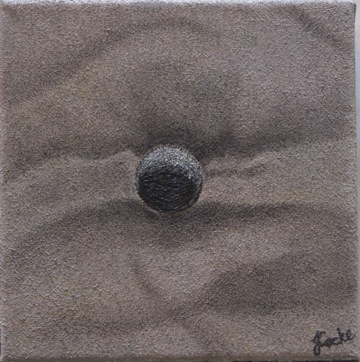
"Middle Beach - Embedded."

"Middle Beach - Go West."

"Middle Beach - Nestled In."
Subscribe to:
Posts (Atom)